martes, 29 de diciembre de 2015

Isometric Projection


During this term we are going to work on perspective. First of all and after watching the video and the presentation to figure out the axonometric projection fundamentals, you´ll be given a handout to desing and draw 3D solids using SketchUp.


View more presentations from


We´ll use SketchUp to get the shape of the solid the way you can find on the video below. 
Download the cube and start creating your own solid. You have to save and upload it to the 3D Warehouse website (you´ll need a gmail account).
Here you can find the worksheet that you are going to use after creating your 3D models.


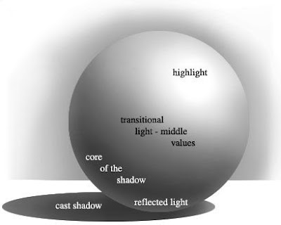
I´ll give you an isometric handout so that you can work on the drawing and shading of a 3D cube like the one on the picture. If you need to download the file and print it out, here you can find it.
First we´ll try to draw different solids based on the same cube. If you want you can include slanted surfaces. Click here to get the worksheet.


You will use three values of the same colour, the way you can find on this achromatic scale.
A good choice could be to pick numbers 3 for the darkest side of the cube, 1 for the lighter part and 5 for the intermediate side. If you have slanted surfaces beware to choose another value according to the position of the light source.


Link to access GeoGebra applet (isometric projection/orthographic views)

domingo, 29 de noviembre de 2015

Christmas crafts

Icosahedron


This a curious lamp that I have used for decoration.
 You only need to follow the steps to make it in a really easy way. I printed the template above out  five times on scrapbook paper to get it.


martes, 20 de octubre de 2015

LINEAR SYMMETRY AND CMYB COLOUR


A Linear symmetry is the type of symmetry in which a line is drawn from the middle of the figure.
The two parts of the figure coincide, then each part is called the mirror image of the other, the part of the figure on one side of a virtual line falls exactly over the other part. Such a figure is called a symmetrical figure.
The line wich divides the figure into two equal parts is called the line of symmetry.
Shapes or figures may be horizontal, vertical, both horizontal and vertical, infinite and no line of symmetry.  http://www.math-only-math.com/linear-symmetry.html


If you want to get what you can see on the examples you will need a basik sheet of paper (A4), tracing paper, an HB pencil, and coloured pencils as well. In order to get saturated colours you will also require felt tip pens.
You are going to search for a picture such a portrait on a magazine. The face has to be completely facing forward in such a way that you can divide it into two symmetric parts by a vertical axis. (Both parts have to be equal when folding the paper over this line).

SUBSTRACTIVE COLOURS: CMYK (From Webopedia)
Short for Cyan-Magenta-Yellow-Key (Black), and pronounced as separate letters. CMYK is a colour model in which all colors are described as a mixture of these four process colors. 
CMYK is the standard colour model used in offset printing for full-color documents. Because such printing uses inks of these four basic colors, it is often called four-colorprinting.

In contrast, display devices generally use a different color model called RGB, which stands for Red-Green-Blue. One of the most difficult aspects of desktop publishing in colour is colour matching -- properly converting the RGB colours into CMYK colours so that what gets printed looks the same as what appears on the monitor.

Here you have an interesting video on substractive colours and colour printing.

sábado, 17 de octubre de 2015

PHOTOPEACH

You are going to talk about yourselves using Photopeach to create a Slideshow.
Think about the way you are and choose at least 15 pictures that depicts it.
Don´t forget about using music and texts to tell your own story.
Photopeach is quite easy to use. Here you have a short video to show you how to make a Slideshow.
  Another tutorial in spanish

jueves, 24 de septiembre de 2015

PERSISTENCE OF VISION

Persistence of vision is the commonly used term to describe the optical illusion whereby multiple discrete images blend into a single image in the human mind and believed to be the explanation for motion perception in cinema and animated films. (WIKIPEDIA)
Persistence of vision is still the accepted term for this phenomenon in the realm of cinema history and theory. 
A frame rate of less than 16 frames per second (frame/s) caused the mind to see flashing images. Audiences still interpret motion at rates as low as ten frames per second or slower (as in a flipbook), 
Modern  film runs at 24 frames a second.

We are going to work on Flipbooks in order to get motion out to still images.
Let´s try one using this site.


Once we have done a digital one, we´ll start working on paper.

domingo, 20 de septiembre de 2015

Op Art

Movement in Squares, by Bridget Riley 1961
Op art, also known as optical art, is a style of visual art that uses optical illusions.
 Op art works are abstract, with many better known pieces in black and white. Typically, they give the viewer the impression of movement, hidden images, flashing and vibrating patterns, or of swelling or warping.

Op art is a perceptual experience related to how vision functions. It is a dynamic visual art that stems from a discordant figure-ground relationship that puts the two planes—foreground and background—in a tense and contradictory juxtaposition. Artists create op art in two primary ways. The first, best known method, is to create effects through pattern and line. Often these paintings are black-and-white. (Wikipedia)


The video bellow is a good example of what we are going to work on.

We are going to try the colored version of this optical illusion.
Have a look at this video in order to know how to use colored pencils.